
New Logo Contest Winner
Float these ideas!
You may recall some time back in a beerfloat.calm mailbag blog we asked you to submit entries for our New Logo Contest. And then we asked again, and again.
Maybe we were asking a bit too much of you? You thought, I don’t have the chops for that. Or maybe your hectic lifestyle didn’t give you time for a creative outlet, that makes us sad. Or maybe your just lazy. That’s sad too.
Whatever the case, we did get quite a few entries and through a straw poll here at beerfloat.calm we have chosen our favourite, but before we reveal our new look we will give you an idea of some of what was on offer.
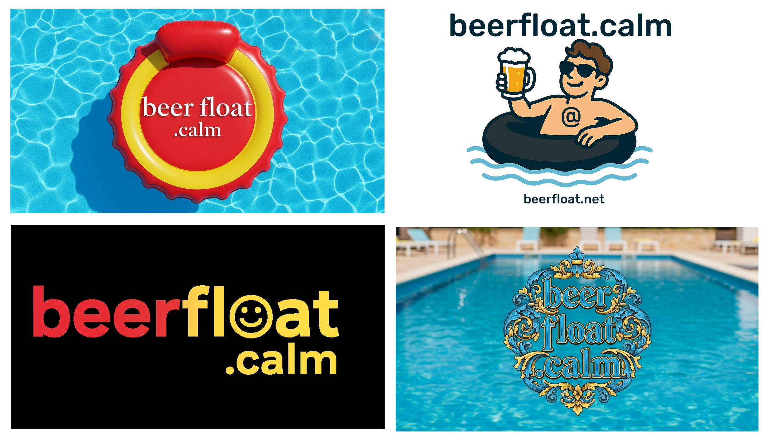
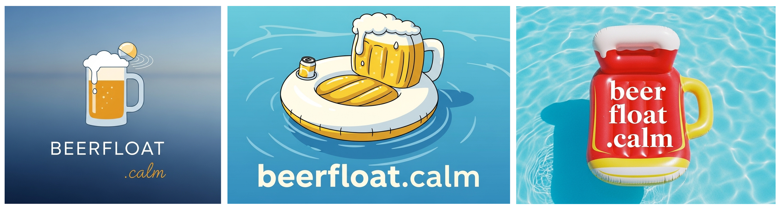
Of course, having beer in our title we had a few entries which included some form of image related to the mighty quaff.
We received logos with glasses filled with the frothy beverage and we also got images which included flotation devices shaped like a beer drinking vessel.
There were a couple of entries with floaters on their vessels holding up a filled mug and one shaped like a glass bottle cap. However, we don’t condone glass in or around the pool so those entries were all no-nos.
A few of our entrants embraced the idea of using a smiley face, a common theme at beerfloat.calm, which we liked except none of them displayed our brand title well enough for use as a logo. We have however passed some of these images to our merch department for future consideration.
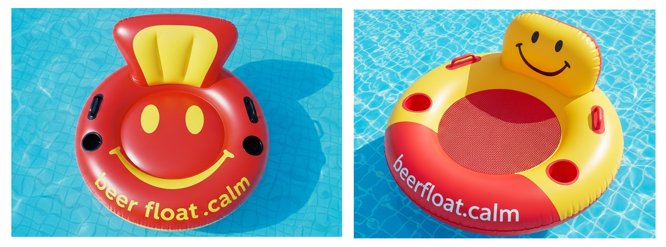
One we liked quite a bit, from Sylvie, uses a smiley image, a pool float and a beer but again it featured glass and it only takes one broken piece to create a bloody mess in a swimming pool.
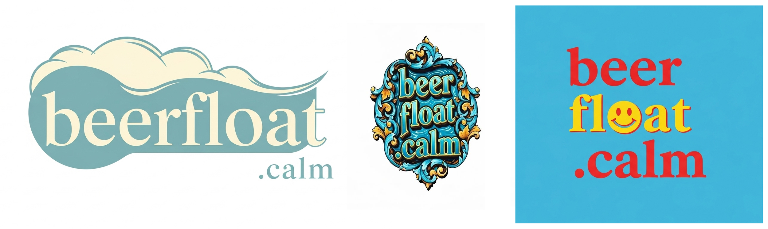
Then there was a selection of logos which were just word based but didn’t say anything about experiencing a beer float. We don’t want people to think ice cream is involved.
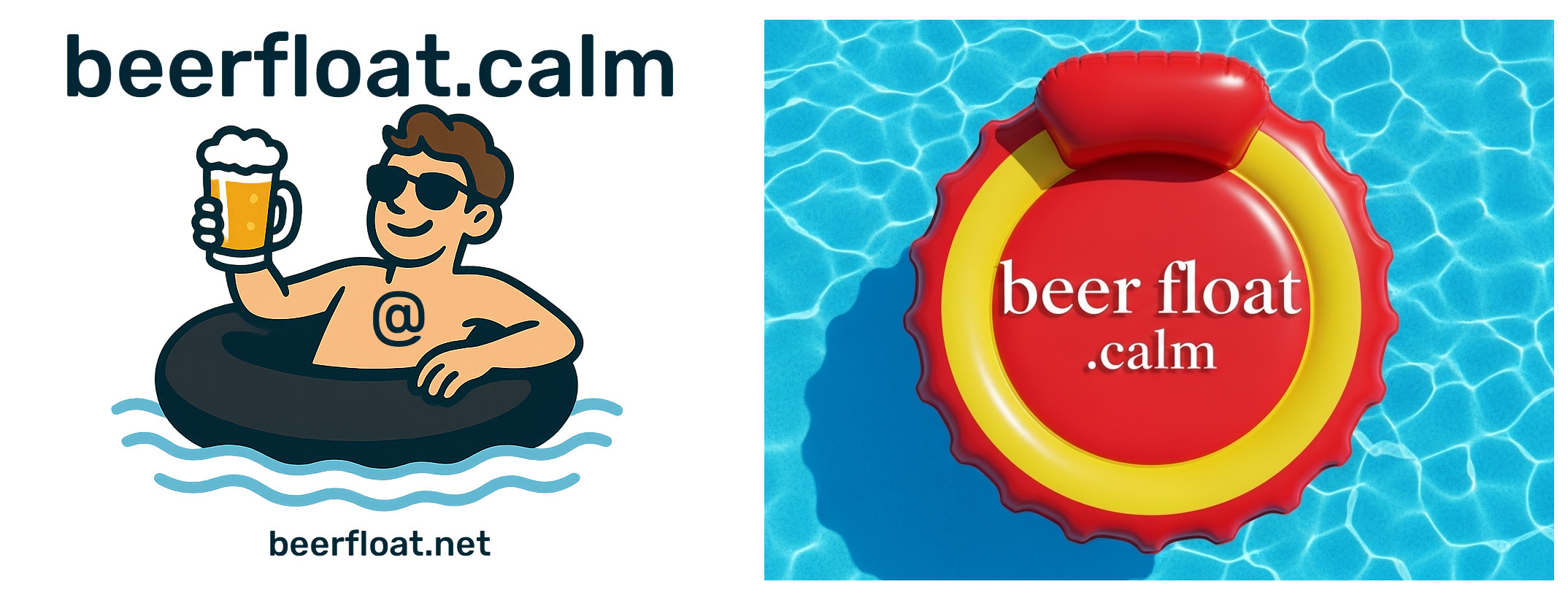
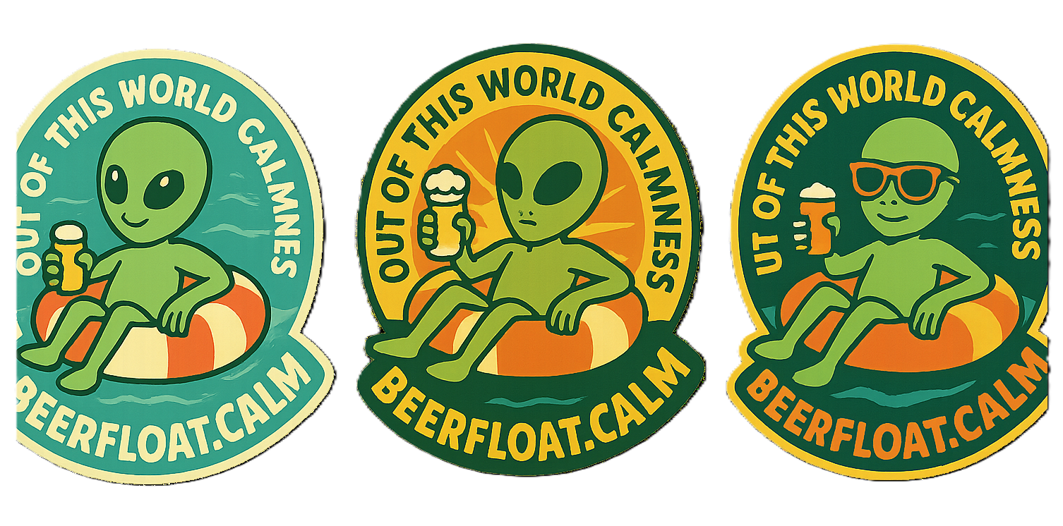
Gus from Canada took his concept from Corliss’ original beerfloat mailbag reply to Victor Chen when he wrote, “…the image of beer floating, which at some point in the future when an alien race with far greater wisdom than ourselves is overseeing the peace on this semi-blue orb will have made beerfloat, an intergalactic mandatory activity for the well being of all kind!”
Here are three of his ‘out of this world’ logos.
Stig from Finland sent us a whole slew of entries two of which we liked a lot. Both used our existing motif with a red and yellow float and beerfloat.calm written boldly overtop. Uncomplicated and on the mark.
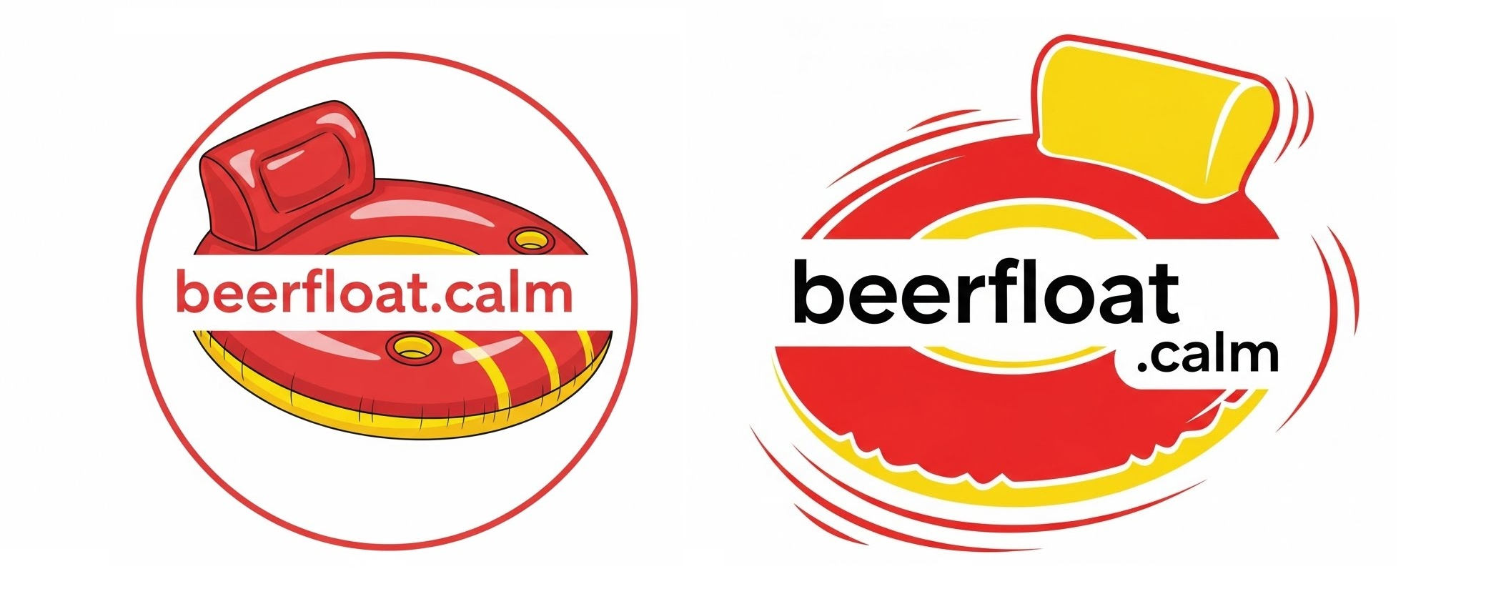
Another bold entry, from Errol, is a real attention getter but we noticed the yellow portion of the flotation device isn’t a concentric circle. We even sent a message to Errol asking him if he would like to send in an alternate version, but he has not replied. In any case when it came down to it many of us thought it looks a little too ‘corporate’ for our ‘feel’ and branding.
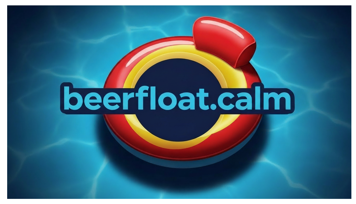
Finally, our team agreed upon something similar to our original logo. We wanted to keep it simple and to the point using the same basic imagery but with much higher quality. Our thanks go to all participants for their fine efforts but alas only one could be selected as the winner of the beerfloat.calm New Logo Contest.
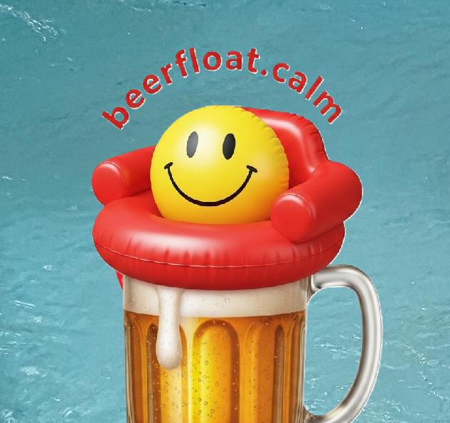
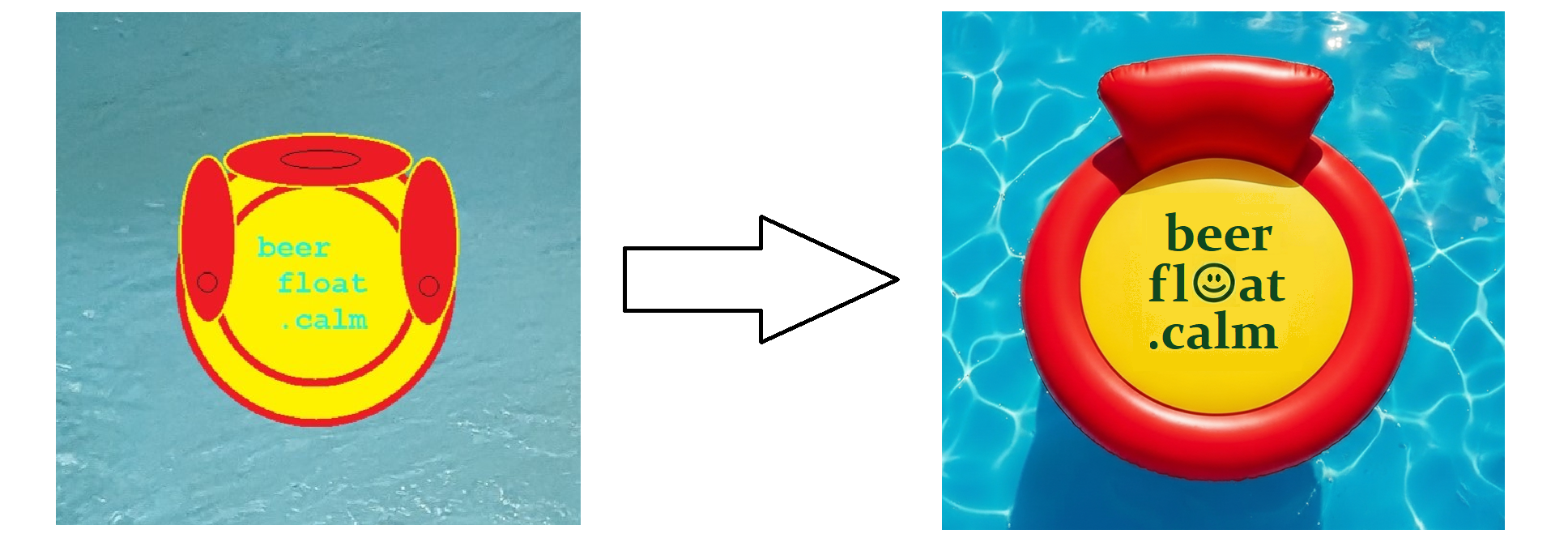
Congratulations to Oskur, who said he took our old logo and just refreshed it. The main ‘change’ is to the title itself where he replaced the blue font with green so that his upgrade now includes all four of the colours in our branding, Pool Water Blue, Sun Blaze Yellow, Devil Red and Dark Ocean Green. He even used our Constantia font and put a little smiley face in the middle!
If you didn’t notice it already in the website header, without further ado we have gone from old to new…
It is what the aliens want!
Happy New Year!
The Staff at beerfloat.calm
beerfloat.calm = beerfloat.net not beerfloat.com